Product Design - Goalspark
Rapid prototyping and user testing for market fit
My Responsibilities
User Flows
Prototyping
Visual Design
Project Summary
A prototype was put together to be tested through UserTesting.com in order to see if the app was worth developing.
Interesting Facts
151 out of 204 user test participants confirmed that yes, they would use an app like this if it were available.
Timeline
2 weeks from initial screen creation to first test
4 weeks for round two iterating and testing
Goalspark is an app concept centered on aggregating data tracked by a person across their preferred array of apps, so that they can easily get an overview of their progress toward each of their goals in a single place.
Framing the design challenge
I met with the client and we discussed the end goal of this design: get a simple prototype he could put on UserTesting.com to see if people would use an app like this. He talked me through his vision and I identified the flows that would be best suited to give users the clearest idea of the app.
Mapping the site structure and building a testable prototype
Before beginning to create screens, I did a small sitemap outline and a wireflow to capture the hierarchy of the app’s sections. This was instrumental in ensuring the prototype was linked together correctly at the end.
I proposed a guided onboarding flow for the initial sign-up segment, to help walk users through linking their first apps such as Noom or Mint that would form the basis of their custom dashboard. The client wanted the app to look and feel ‘real’ (instead of low-fi wireframes) for testers. I used existing UI kits and design system components to quickly create polished-looking layouts.
One app to track all your goals
The core home of the app would be the screen where users would see all of their categories at a high level. Hovering would reveal more detail; clicking would take them to a detailed dashboard.
Other dashboard screens existed to round out the experience, such as this one depicting how much time was spent in various activities. Other parts of the experience included a data table where you could see metrics of your goals, and the groups section, where leader boards and conversations to encourage (or goad, for your gym buddies) one another could take place as they worked together toward a goal.
Rapid testing results and next steps
We iterated on the designs over two weeks, then he released it for testing on UserTesting.com. The reception was decidedly positive. Out of 204 total users tested, 151 said they would use the app; with only 24 saying they wouldn’t use it.
With the initial testing wrapped, we met again to decide further action.
We decided a mobile app would be the place to start, and set about designing a similarly “mid-fidelity” prototype to test.
Refining the product plan and architecture
For this round, I put together a timeline and project summary document for the client, as well as a place to store our work. The client could talk about what he wanted, but didn’t have an articulated vision statement in writing, so I built one out based on what he described to me. I recommended we move the design work to Figma for easier prototyping and commenting going forward, which we did to positive results.
Based on feedback from users during the first testing, I made some adjustments to the sitemap to better suit mobile usage.
By this time, the client had a clearer idea of things he wanted the app to be able to do, so we incorporated those pages.
He had a concept of a group/social component as a differentiator, so we’ve worked group findability and joining into this round of prototyping to see how users respond.
Seeking UI inspiration
Before diving deep into design efforts, I set up a Google Slides deck as a moodboard to drop in images and links to inspiring design concepts. This would make it easy to share with the client and discuss things we liked or didn’t (and why!) via comments.
A simple persona
The client didn’t have or require any personas for the project, but I built a quick provisional one out based on the test results and commentary from users of the last round, if only to help inform my designs somewhat.
From sketch to screen
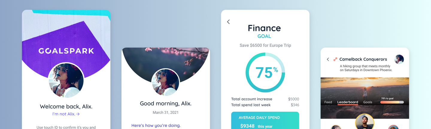
Each of the main pages for the app’s distinct sections were done in sketches first so we could quickly talk through the ideas before committing to higher fidelity screens for the prototype. The client wanted to test in higher fidelity again, because some test user commentary around lower fidelity samples had them distracted by the lack of design. This time around, I also constructed a small design system to manage the visual assets as we built.
Wrapping it up
We tested this round further and found that while there was as much enthusiasm as before, the cost of development for the project was higher than he was ready to carry forward with for the time being. The testing for market fit helped us to pivot and focus on a mobile first approach thanks to the overwhelming user data pointing us in that direction, however, and we have the building blocks of an app designed should he choose to continue this business idea in the future.